Apart from its dreamlike texture and motifs of speed and time, Standart Issue 31 is special in another sense, too. It marks—for the small world that exists across our issues, team, and readers—a beginning of a new era.
Over the past six months or so, we have been developing an uplifted design scheme—one that works even better to express the manifold stories we yearn to tell from all over the world of coffee. A refreshed approach to design, typography, imagery, and structure awaits you, inviting you to explore the issue with a greater sense of connection and intimacy.
What sets our new design apart from others on the market? It all starts with our desire to spark curiosity. We want reading Standart to feel like stepping into your favorite café and engaging in a spontaneous conversation with a barista or fellow customer.

Our new logo, presented in contrasting black or white, reflects the two most common ways coffee is consumed. The colors throughout the publication, including the cover and brand assets, are inspired by flavors, capturing the diverse smells and tastes from different coffee origins. The result is a curated and purposeful color palette that celebrates the flavorful spectrum of the coffee world.
But it's not just about aesthetics; our design lives and breathes. It's distinctive, confident, and bold, yet approachable and fun.

The use of a sans-serif font, featuring a quirky R and ample breathing space, adds to the inviting atmosphere. Typography plays a playful role, with occasional floating letters and titles, connecting our content in a unique and visually captivating way. This approach is a reflection of our unconventional content production and the steps we've taken to thrive in an industry that has often been filled with boring stereotypes.

For us, the tactile experience of reading is paramount. We've chosen high-quality uncoated paper by Papyrus and experimented with different papers within the same issue, enhancing the sensory delight of engaging with our magazine. We believe in the value of print media, as it allows us to disconnect from the constant glow of digital devices and immerse ourselves in a relaxing and enriching experience.
An important goal we achieved with our new design was the uplift of the magazine's format, which resulted in producing almost no paper-cut waste during production, consuming 50% less printing plates and saving energy by reducing the printing machine run time.
This also means that starting from Standart Issue 31, we increased the size of the coffee sample by a whopping 40%, now providing a total of 50g of beans. Moreover, we have expanded the number of content pages by 10%, resulting in a grand total of 168 pages filled with pure reading bliss.
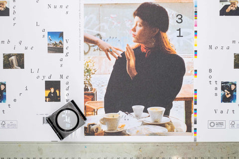
Our new design also aims to improve the overall reading experience by giving photography and other imagery a more prominent role. We've partnered with talented photographers like Olimpia Piccolo for captivating cover stories that capture the essence of coffee culture in cities like Rome. Typography plays a vital role, with the combination of 'Karl' and 'Mercure' fonts bringing joy, energy, and historical inspiration to our pages. Illustrations by Michael Haddad serve as a guiding line throughout our issues, connecting readers to the stories we share.


In the coffee industry, we see a shift toward authenticity and a desire to explore beyond the glossy façade of third-wave aesthetics. Standart's new design reflects these industry trends, combining timeless elements inspired by ancient typography, mid-century branding, and the demands of today's readers. We recognize the importance of social media and digital platforms in reaching coffee enthusiasts, and our bold logo and provocative photography aim to attract attention both offline and online.
Our new design takes cues from the standard—integrating units and grids. As explained by Sebastian Campos, Typographer & Graphic Designer with whom we've collaborated with:
"In the mark the 8 capital letters of the name divide the width of the page into a series of equal intervals suggesting the visual language of weights & measures (rulers, tapes, scales, etc). A standard is a unit.
The mark repeated vertically divides the height of the page into a second set of equal intervals and suggests a system of coordinates describing a space. A standard is a grid.
Every headline in the publication will outline a section of that space with words, syllables, and individual letters arranged loosely across the space like places in a map. A standard is a point of reference. You are here."
So dear reader, grab a cup of your favorite brew, settle into a cozy corner, and let the new Standart design take you on a journey that will leave you inspired, informed, and craving for more.
