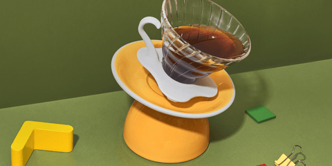
Standart issue 19 not only comes with an overhauled interior design language, but also an exterior one. We needed a cover that was striking at first glance and represented some of the deeper themes covered in the issue.


 Cover set designer Ekaterina Starostina (@rfnzrfnz) told us:
 “The most difficult part was securing the objects, especially those with liquid inside. First, I figured out the composition, selected the details and locations of items, and then came the hard part: to find the optimal balance between elements and to fix them in position."

It was nevertheless important to preserve the general principles of the composition: the items shouldn’t look disconnected, as if they were levitating themselves, but should interact with the other items. Through the delicate balance along diagonal planes, the items exhibit movement and energy, and work to reinforce each other.

We’re really excited for you to get your hands on the latest Standart, and experience this work of art first-hand. Get yours here.
Cover set design: Ekaterina Starostina (@rfnzrfnz)
Cover photography: Klim Bogdanov (@klimbogdanov)


